

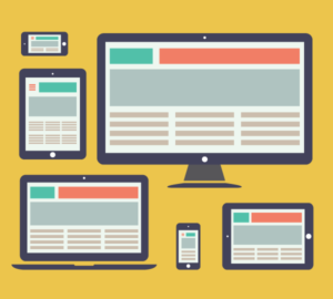
The time is January 2021, and right now as I type this, mobile devices account for 51.33% of all web traffic, and this bullish trend is set to continue far into the future. Things were not always this way though, if we go back 11 years to 2010, Three years after Apple had it’s iPhone debut, mobile devices accounted for a meagre 4% of all web-based traffic. Since then, as mobile device manufacturers started mass producing smartphones and tablets, their numbers have exploded, bringing us to today where smartphones are used by 3.6 billion people!! With all of these different devices come different screen sizes that have to be accounted for from a web development perspective. This leads us nicely into Responsive Web Design
In this article, we’re going to go through the history of responsive web design, how it works, and get a glimpse of where it might be going in the future.
The humble beginnings of the Internet
Do you remember the early days of the modern internet, maybe not quite as far back as the worlds first website in 1990 but lets fast forward 10 years to when the likes of altavista and yahoo were the internets front pages?

From a design perspective, your task was relatively straight-forward, almost everyone accessing the internet was doing so from desktop computers with a small number of resolutions to work with. Designing for different screen sizes was not something that designers were particularly concerned with.
As the underlying technology progressed, the internet began to grow enormously in popularity, with more and more people becoming interconnected with one another, people were now accessing the internet from a plethora of different devices and screen sizes, this was often leading to inconsistent user experiences.
With smartphone technologies on the rise. The internets users were now accessing it from both their desktop computers and handheld devices. This is where Responsive Web Design enters the fray. To provide a consistent user experience across all devices, websites need to be responsive.
Responsive Design
The term Responsive Web Design was coined by author, developer and web designer Ethan Marcotte for the first time at An Event Apart (AEA) Seattle on April 6, 2010, in a talk titled “A Dao of Flexibility.”
Ethan stated that in order for a web design to be considered “responsive,” it requires three main ingredients:
- The site must be built with a fluid grid foundation.
- Dynamic and flexible imagery should be part of the design.
- Media Queries must be used to display different views for the wide variety of screen sizes.
It is important to note that all three features need to be implemented in order for a truly responsive web design to take place.
So what is Responsive Web Design?
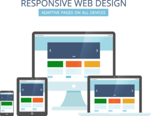
Responsive web design is an approach to web design that makes web pages render well on a variety of devices, browser windows or screen sizes.
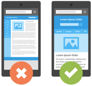
Let’s have a look at some of the inherent problems of “traditional websites” when being accessed from different devices. If the website is viewed on a desktop computer, for instance, the website might show three columns and display as expected it should. But, If viewed on a small tablet, it might force you to scroll horizontally to see all of the web pages content, this leads to a poor user experience. Some elements might also be hidden from view or not align properly. Worse still, it is also complicated by the fact that most tablets can be viewed either in portrait or landscape orientation’s leading to more scaling issues.
On smartphone screens, websites can be even more challenging to see. Smartphones provide a very narrow canvas to work with. Large images may “break” the layout, tables do not display properly. Sites can be extremely slow to load on smartphones if they are trying to display and parse all of the elements of a desktop website on a tiny screen.
When a website uses a responsive design; however, the tablet version should automatically adjust to display fewer columns. This way, the content is readable and easy to navigate. On a smartphone, the content typically appears as a single column, this is usually stacked vertically. Images dynamically resize instead of distorting the layout or overflowing.
The point of responsive web design is that the website automatically adjusts and serves content to the end-user based on the device that the website is being accessed from.
How does Responsive Web Design work?
A site designed with Responsive Web Design adapts the layout to the viewing environment by using fluid, proportion-based grids, flexible images, and CSS3 media queries, an extension of the @media rule, in the following ways:
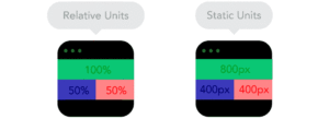
- The fluid grid concept calls for page element sizing to be in relative units like percentages, rather than absolute units like pixels or points.[8]
- Flexible images are also sized in relative units, so as to prevent them from displaying outside their containing element.[9]
- Media queries allow the page to use different CSS style rules based on characteristics of the device the site is being displayed on, e.g. width of the rendering surface (browser window width or physical display size).
- Responsive layouts automatically adjust and adapt to any device screen size, whether it is a desktop, a laptop, a tablet, or a mobile phone.
Reference(wikipedia)
Fluid Grid
The layout of a responsive website has to respond and adapt to the dimensions of the end-users device to which it is displayed (responsive design). A fluid grid layout style provides us with a way to create a variety of different layouts that correspond to the devices on which the website is displayed.
For example, in modern times your website is going to be viewed on desktops, tablets, and mobile phones. Using fluid grid layouts, you can specify layouts for each of these devices. Depending on whether the website is displayed on a mobile phone, tablet or desktop computer, the corresponding layout will be used to display the website.
Most modern browsers and search engines use a piece of technology called a user agent. It is the user agents job to fetch information about your device and feed this to the webserver. For example, (in the case of responsive design) when you access a website on a mobile device, the user agent provides this information to the webserver which then, in turn, serves you a mobile version of the website, instead of a desktop version which would be the case when a responsive design has not been utilised.
In fluid grids, a maximum layout size for the design is defined. The grid is then divided into a given number of columns which keeps the layout clean and easy to handle. Each element is designed with proportional widths and heights in percentages instead of static pixel-based dimensions.
Flexible Images
Imagery that scales and moves with a flexible grid is one of the other key features of responsive web design. Loading massive images that your desktop computer can handle accordingly and serving these same unscaled images to a mobile device with a resolution of 720 x 1280 is a very bad web design practice. Scaling these images and serving the correctly sized image to user agent should be your aim when designing websites.
Large images or even many smaller images might make your site look prettier but can have massive performance ramifications, depending on your website and business this might not be an issue, but if you are a mass media website or are running a photography website then this may apply to you. In recent web design trends, however, we are constantly seeing sites that incorporate fewer and fewer unnecessary images.
A popular alternative to scaling imagery is to crop them through the use of CSS. The CSS overflow property (e.g. overflow: hidden) gives us the ability to crop images dynamically as their containers move to adapt and fit new display environments.
There is also the option to have multiple versions of the same image on the webserver, that dynamically serve the appropriately sized version depending on the user agent using server-side or client-side feature detection in tandem with DOM manipulation.
Another alternative is to hide imagery altogether for various user agents, if we really want to put the users focus on the text-based content, this is achieved using media queries that serve a stylesheet which sets the display: none property for the selected images.
When it comes to web design, web page loading speed is a very important consideration with Google indicating that it is one of the signals used by its algorithm to rank pages.
Media Queries
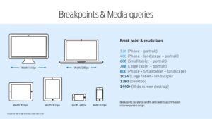
Since the days of CSS 2.1 stylesheets have been using an element of device awareness through Media types. [Source]
<link rel="stylesheet" type="text/css" href="core.css"
  media="screen" />
<link rel="stylesheet" type="text/css" href="print.css"
  media="print" />
In the hopes that you would be designing more than neatly formatted page printouts, the CSS specification supplied us with a bevy of acceptable media types, each designed to target a specific class of web-ready device. But most browsers and devices never really embraced the spirit of the specification, leaving many media types implemented imperfectly, or altogether ignored.
Thankfully, the W3C created media queries as part of the CSS3 specification, improving upon the promise of media types. A media query allows you to target not only certain device classes but, to actually inspect the physical characteristics of the device rendering our work. For example, following the recent rise of mobile WebKit, media queries became a popular client-side technique for delivering tailored style sheets to the iPhone, Android phones, and their ilk. To do so, we could incorporate a query into a linked style sheet’s media attribute:
<link rel="stylesheet" type="text/css"
  media="screen and (max-device-width: 480px)"
  href="shetland.css" />
The query contains two components:
- a media type (
screen), and - the actual query enclosed within parentheses, containing a particular media feature (
max-device-width) to inspect, followed by the target value (480px).
In plain English, we’re asking the device if its horizontal resolution (max-device-width) is equal to or less than 480px. If the test passes—in other words, if we’re viewing our work on a small-screen device like the iPhone—then the device will load shetland.css. Otherwise, the link is ignored altogether.
Designers have experimented with resolution-aware layouts in the past but, the media query specification provides a host of media features that extends far beyond screen resolution, vastly widening the scope of what we can test for with our queries. What’s more, you can test multiple property values in a single query by chaining them together with the and keyword:
<link rel="stylesheet" type="text/css"
  media="screen and (max-device-width: 480px) and (resolution: 163dpi)"
  href="shetland.css" />
Furthermore, we’re not limited to incorporating media queries in our links. We can include them in our CSS either as part of a @media rule:
@media screen and (max-device-width: 480px) {
  .column {
    float: none;
  }
}
Or as part of an @import directive:
@import url("shetland.css") screen and (max-device-width: 480px);But in each case, the effect is the same: If the device passes the test put forth by our media query, the relevant CSS is applied to our markup. Media queries are, in short, conditional comments for the rest of us. Rather than targeting a specific version of a specific browser, we can surgically correct issues in our layout as it scales beyond its initial, ideal resolution. Reference[ResponsiveWebDesign]
Media queries, therefore, are not just a mobile or tablet solution (although they’re very often associated with them). Rather, media queries and responsive web design allow us to think outside of the constraints of a given screen size or resolution and start constructing sites that can flexibly adapt to any screen size, be it your phone, desktop or tablet.

Screen resolution, Screen size and Viewport: What do these terms mean?
When you are on the market for a new device be it a laptop, tablet or phone you will typically see both screen size and resolution listed in the specs. The screen size relates to the physical measurement diagonally of the screen in inches. This is very often confused with resolution. The screen resolution is the number of pixels on the screen often displayed as width by height (i.e. 1024×768).
As a result of devices with the same screen sizes having very different resolutions, developers use viewports when they’re creating mobile-friendly pages.
What is a Viewport?
Viewports are scaled-down versions of resolutions that allow sites to be viewed more consistently across different devices. Viewports are often more standardized and smaller than resolution sizes.
It is a best practice to set a viewport <meta> tag when designing a responsive website. The viewport tag is typically inserted into the <head> section of the HTML on each page of a website:
<meta name=”viewport” content=”width=device-width, initial-scale=1.0″>
Why is Responsive Web design important?
The end goal of responsive web design is to avoid the completely unnecessary zooming, scrolling, resizing, or panning that always occurs with sites that have not been optimized for any screen size other than a basic desktop computer. It is more often than not, very difficult to navigate these sites, and leads to a poor overall user experience.
Constructing websites using the concept of responsive website design also replaces the need to design a dedicated mobile website for smartphone users. Right now, instead of designing multiple websites for the plethora of different screen sizes, you can just design a single website that has the ability to scale up or down automatically (responsively) to match the device it’s being viewed on.
Benefits of Responsive Web Design
- A single site for every device: Whether a website is viewed on a 30-inch screen or from the screen of your iPhone, the website will be configured and served for the user’s optimal viewing pleasure.
- Optimal design for the device: With the responsive web design approach, all images, fonts, and other HTML elements will be scaled appropriately, maximizing whatever screen size the user has.
- Remove redirects and speed up your site: An old method (still in use by some) was to redirect website users to a different version of a website that had been optimised for a particular device. These mobile versions are often served through a different subdomain like m.<site-name>.com to distinguish them from their desktop equivalents. This method is easy to implement, as designers don’t have to deal with the variety of different screen sizes. But it’s also often discouraged because if not properly configured it can devastate SEO because of duplicate content issues. This method was used by Facebook, Wikipedia, and other huge websites, for similar reasons.
Responsive Web Design is an ideal solution which for massive websites can be a difficult task to implement.
Mobilegeddon
Back in 2015 Google rolled out their Mobile-Friendly update to Google Search and in no uncertain terms stated: “When it comes to search on mobile devices, users should get the most relevant and timely results, no matter if the information lives on mobile-friendly web pages or apps.”
Google stated that would be extending the use of mobile-friendliness as a ranking signal. What this meant was that pages that were mobile-friendly that closely matched a searchers query would be served higher in the Search Engine Results Page over pages that had not yet been optimised.
Since that update as more people started to take notice it is now much less common to have to pinch the screen of your mobile phone to zoom in and read the text.
Following this with a further emphasis on the end-users experience came Google’s announcement of Mobile-first Indexing as mobile devices performing Google Searches overtook searches that were being carried out using desktop computers, Googles Search Engine algorithm had always been crawling, indexing, serving and ranking websites based on the content of the desktop version of their sites, whereby in many cases, the mobile version of websites contained significantly less content than their desktop equivalent. The mobile-first index was a push to prioritise, crawling, indexing, serving and ultimately ranking websites based on their mobile site content.
How do I know if my website is mobile friendly?
There are a number of ways to check if a website is mobile-friendly, possibly the easiest way to check is using a tool that Google has developed called the Mobile-Friendly-test. You simply enter your URL and click “test URL”, the results page will give you an indication of whether or not the page is mobile-friendly.
Another way is to access the developer tools section of your browser to review the elements of the page.
Google Chome is the most popular browser in use today. To access the developer tools in Chrome, use the keyboard shortcut CmdShiftJ (on Windows) or CmdOptionJ (on Mac).
How do I make My Website responsive?
Now that we understand a bit more about what it means to be a responsive website, a good place to learn more about implementing responsive designs and getting started with it yourself is at w3schools or web devs responsive design basics.
What is Adaptive web design?
To reference an article from interaction designs Mads Soegaard:
Adaptive Web Design was introduced in 2011 by web designer Aaron Gustafson in his book, Adaptive Web Design: Crafting Rich Experiences With Progressive Enhancement. It is also known as a progressive enhancement of a website.
Where responsive design relies on changing the design pattern to fit the real estate available to it, adaptive design has multiple fixed layout sizes. When the site detects the available space, it selects the layout most appropriate for the screen. So, when you open a browser on the desktop, the site chooses the best layout for that desktop screen; resizing the browser has no impact on the design.
Choosing Between Responsive and Adaptive Design
Responsive design is easier and takes less work to implement. It affords less control over your design on each screen size, but it’s by far the preferred method for creating new sites at this moment. This may also have something to do with the large number of cheap templates available for the majority of Content Management Systems (CMS) such as WordPress, Joomla, etc. — after all, who wants to reinvent the wheel?
Responsive designers create a single design to be used on all screens and will generally start in the middle of the resolution and use media queries to determine what adjustments will be made for the lower and higher end of the resolution scale. This tends to make users happy because that familiar web design seems guaranteed to translate across to any device’s screen. Uniformity and seamlessness are crucial considerations in providing a good user experience.
It’s important to keep an eye on the visual hierarchy of responsive design projects; you want to try to maintain this as your elements shuffle around the screen. That means a lot of testing with many different devices to be certain that you’re delivering the goods. If the design for a site is relatively simple, it will translate well across device screens, flowing like a liquid from the container to container.
SEO is another big argument for using a responsive design. Sites that use responsive design (i.e., ones with a URL that serve all devices) are currently more search engine friendly.
The responsive design seems to have a strong case for use. Well, it might; however, bear the following in mind:
- Because your website will “flow” from device to device, adjusting to the screen size, any advertisements that you’ve added may not fit into the space. Suddenly, the “shortcut” offered by using responsive design may need some rethinking and work.
- Download times vary between desktop and mobile devices. The flexibility of images is a big consideration here. A large design that comes through quickly on the big screen at home or in the office takes more time (and data) to appear on your mobile. Might a smaller preview be better for the mobile version?
The adaptive design will (theoretically) ensure the best user experience according to whichever device the user is using to interface. Unlike responsive design, where a screen “flows” from desktop design into a smaller device’s, the adaptive design offers tailor-made solutions. As the name suggests, they adapt to the user’s situational needs and capabilities. As designers, we can show users that we’re in tune with their needs on a mobile device by making our design touch-friendly. Meanwhile, we can do the same for desktop users. We begin at the lowest resolution version of the site and work our way up to the highest. Six designs are the current standard, but depending on your users’ data, you might be able to use fewer designs. Reference [adaptiveVSresponsiveDesign]
Where are we going with all of this?
We have been working with percentage-based grids using the method Ethan Marcotte outlined in his article on Fluid Grids. This formed the basis of the concept that we now know as “responsive design.” If we then want to modify the proportions of these columns, we will have to add a breakpoint using a Media Query and redefine them. We do not have any other options when working in percentages, as they will always carry the same percentage of the container that they are in, whether that container is narrow or wide.
The use of Flexbox and Grid Layouts, along with Multi-column layouts are responsive by default. These specifications were written in a world where responsive design and supporting multiple devices was already a thing. This means that they include a lot of common-sense functionality, which enables responsive design without us needing to do much.
Media Queries Level 4: What Can We Expect?
The media queries we have been using for Responsive Design so far, come from the media queries Level 3 specification. A new media queries specification is under development at the CSS Working Group, Media Queries Level 4. That specification will bring some changes to syntax, and some new functionality. Not everything here is implemented in browsers yet but it is interesting to see what might be coming soon, to help us create user interfaces that work well with the wide range of devices and output formats we have. Reference[Media Queries Responsive Design]

The Future of web design
As we have seen throughout this article and within our own lifetimes, technology continues to improve, and the internet continues to become much more accessible to the masses as the number of users grows exponentially.
The trends in mainstream web design are leaning towards user experience and site performance and will likely continue on this path for the foreseeable future.
This shift is also bringing us towards Web 3.0:
What is Web 3.0?
Web 3.0 is the next generation of Internet technology that heavily relies on the use of machine learning and artificial intelligence (AI). It aims to create more open, connected, and intelligent websites and web applications, which focus on using a machine-based understanding of data.
To finish I will reference quotes from John Allsopp’s A Dao of Web Design, said to be the main influential piece behind the concept of responsive web design:
As observing detail is clarity, So maintaining flexibility is strength;
Use the light but shed no light,
So that you do yourself no harm,
But embrace clarity.
Tao Te Ching; 52 Clarity