
Most will agree that 2020 didn’t go well.
Though that’s not the complete truth. Things are more complex. There is, as always is, a silver lining.
We witnessed innumerable tragedies and political atrocities, but we also witnessed the extraordinary work of scientists worldwide — of all races, genders, and ethnic backgrounds — to sequence the genome of the virus, develop vaccines, test them, and administer them to more than a billion people — in not more than a year and a half!
Extraordinary is an understatement. We have come far. Very far.
Although the extraordinary feat could not have been possible without our extraordinary use of data.
From college students to the most renowned data institutions, data was collected on every little thing to make sense of the chaos. This was an extraordinary feat, one that would involve incredible planning, data management, communication, forecasting, and other qualities of a first-rate data-driven plan of action.
From assessing variants to simulating successive waves, data-driven decisions were taken on an unprecedented scale.
However, data in itself may seem unintelligible, at least to the data illiterate, which are certainly more populous than the data literate. And therefore, what came to define the year was not data. Instead, it was data visualization — visual representations of data that communicate its meaning.
https://ourworldindata.org/grapher/exports/covid-cases-by-source.svg
Total cases, worldwide. Source: Our World in Data
Source: NPR
The daily number of cases, Italy, Feb 23 to Apr 5. Source: Johns Hopkins Univ.
This was the year of graphs and charts — creative, colored, cautionary.
Take the curve scientists and governments were vehemently urging us to flatten.
:format(webp):no_upscale()/cdn.vox-cdn.com/uploads/chorus_asset/file/19874507/flattening_the_curve_2.jpg)
Source: Vox
The red curve illustrates the projected increase in cases had protective measures such as quarantine not been taken. The curve had to be flattened because it was way above the dotted line marking the capacity of hospitals. Compare it to the grey curve, which is below the dotted line, depicting a scenario where cases are high but distributed — in control.
The curve was everywhere, and its effect was singular: it changed behavior.
To make it even easier to comprehend, people represented the curve in more creative ways. Here’s the same curve but as a GIF, simulating different scenarios.
How the virus would spread without obstruction. Source: White Box Analytics
How the virus would spread when everyone engages in social distancing. Source: White Box Analytics
The simulation gets the point across with greater ease.
However, simulations are only as good as the data fed to them.
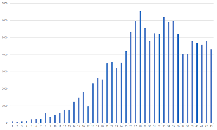
How can we ensure that the data is reliable? One way to confirm the true toll is to plot the number of tests conducted.
Source: Our World in Data
Then, of course, come the vaccines.
As of 16th April 2021, WHO approved 4 vaccines, out of the more than 180 candidates considered for pre-clinical testing.
https://static.dw.com/image/57229467_7.png
Source: Deutsche Welle
And yes, more than a billion people have been vaccinated. But, again, that’s not the full story. The uneven distribution of wealth has ensured the uneven distribution of vaccines.
Here’s the inequality neatly depicted.
:format(jpg):extract_cover()/https%3A%2F%2Fmedia.nature.com%2Flw800%2Fmagazine-assets%2Fd41586-021-01136-2%2Fd41586-021-01136-2_19113040.png)
Source: Our World in Data
Human beings might have a remarkable capacity for abstraction, but on most days, we are a highly intuitive, visual species.
Data visualization is a tremendously powerful tool that leverages that capacity. Data is richer, more Intuitive, meaningful, and hence communicable when it is visualized.
In times of such extreme chaos, data visualization came to the aid of not just scientists and policymakers, but anyone who had access to the internet.
Though the implications of what we witnessed are much broader. If it weren’t obvious, it could not be more today — data will power the future.
