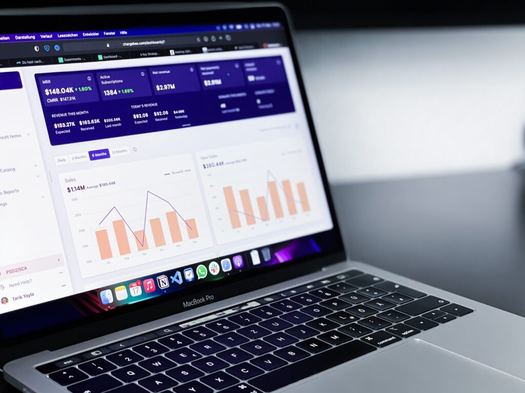
Data is an integral part of the decisions that we make today. Therefore, the dashboard is quickly becoming a tool of choice for most marketers. In a dashboard, you can track your key performance indicators (KPIs) based on your goals.
As a marketer, you have to make dashboards to present to the rest of your team and managers. Here are five practical tips to guide you in building an effective marketing dashboard.

- Determine the Use of the Dashboard
Before creating the dashboard, identify the main reason for doing it, apart from tracking your marketing activities. So, you need to determine:
The Audience
To create an effective dashboard, you need to know who will read and use it. Determine if you will be the audience, your colleagues, the sales team, the marketing team, or the management. Having an audience in mind will help you know what to include in your marketing dashboards and reports and Where to find marketing report templates .
The sales and marketing team will need detailed information, while the management team will require a summary of the essential details. Using tools easy to understand is crucial if your audience is unfamiliar with the data you are presenting.
You can create your dashboard, then use it to make a simpler one or a more elaborate one for your other audiences.
Objectives of the Dashboard
Determine the short-term and long-term objectives you will present in your report. Present the objectives at various difficulty levels to suit your audience. Ensure the goals touch on factors that interest the audience. Also Read : Best Marketing Techniques On The World Wide Web
Activities That You Will Monitor
When you know the activities you plan to use the dashboard to monitor, you can choose the best indicators when creating the report.
For a particular advertising campaign, it will need a dashboard that provides micro-details of the campaign. If it is for tracking daily business activities, one with macro-details will do.

- Determine the KPIs
The metrics that you include in your report should match your objectives. Avoid using many metrics on the dashboard, as this will force you to write little information about each of them. It would make you leave out more important information. The dashboard should be large enough to include vital details for the audience to understand it and make better decisions. An example of metrics is marketing performance metrics for each campaign, like click-through rate and clicks.
After determining the KPIs, analyze them using various measures, such as the source of data and the date. You will gain valuable insights to optimize your performance in the future. Determining the KPIs also enables you to track and show your team’s effort and value in significant business areas. You will know if the action is creating desired outcomes or you are yet to achieve the goals.

- Choose the Data Sources
Data is the backbone of the story you are building on the dashboard, so you have to choose the correct data sources to reach the goals you have outlined. There are many data sources that you can use depending on the type of business you are doing.
Also, consider using sources from outside your department as they may have valuable information, e.g., from the sales department if you are in the marketing department.
Data sources can include:
- Websites
- Social media
- Calls
- Emails
- Campaign platforms
Each data source will have metrics and data that you need to integrate into one platform. You will be able to measure each marketing program’s effectiveness against its source.
Remember, you should not add too much information to the dashboard. Instead, determine what matters most so that you can include it and leave out the non-essentials.

- Select the Best Visualizing Type
Visuals help you convey the message better if you use the right data visualization type and correctly. There are many visualization tools that you can use. Some of them include:
- Bar charts
- Pie charts
- Line charts
- Tables
- Area charts
- Gauges
Ensure the visuals are easy to understand and use when finding additional insights. When using colors in your visuals, remember that some people are colorblind, so they cannot differentiate shades of colors. Therefore, avoid using colors that have the same brightness values. You can change from dark colors to bright colors to make it usable for the colorblind audience.
- Integrate Your Data
After coming up with all the components you want to include in the dashboard, it is time to integrate them into one source. The source should also connect to the outcomes and ROI.
Ensure you choose a tool that will allow you to integrate all data and data visualization efficiently. It will prevent you from losing visuals that have essential information during the integration process.
Conclusion
Dashboards are ideal when presenting data. They help you demonstrate the outcome of your marketing strategies and advice on how to grow your business with metrics. You, therefore, need a clear and accurate data presentation for your audience. When presenting your data on the dashboard, ensure you optimize the presentation by using chart titles, comparing current data to the previous one, and choosing the best format to submit your data.


