
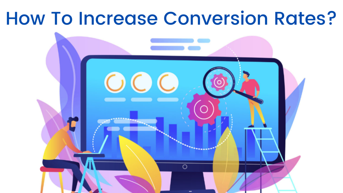
You created your own company. You started your website. You also made that brilliant form to persuade your readers to participate. However, as we all know, refreshing your inbox does not necessarily speed up the appearance of form submissions.

Fortunately, there’s more you can do to improve your forms and increase completion rates. Continue reading for five easy ways to boost form conversion rates. ARForms is the best form builder in the market to create dynamic form with many types of ready-made elements, easy to make form just drag-and-drop feature elements and craft different kinds of forms: like Contact Forms, Survey Forms, Registration Forms, Payment forms, etc.
-
Keep It Simple and Short
See? Even your intelligence isn’t insulted by our new term. Show your audience that you value their time by merely asking for the most necessary details. The higher the conversion rate, the shorter the form.
Even removing one form field can increase submissions by a staggering 50%. Although it’s tempting to include optional fields in the hopes of obtaining additional information, those seemingly innocuous boxes can get in the way of your submission goals.
Making your form clean and simple to fill out will aid your users in reaching the coveted submit button. Ensure each field is clearly labeled, enhancing overall usability and accessibility for those who use screen readers and assistive technologies.
You can add descriptions or instructive language to any fields that require further clarification. Also, as a precaution, provide personalized error messages that guide the user to the appropriate resources for correcting any errors.
-
Use Multi-Page Forms to Make Long Forms More Approachable
We have some good news for you if you just found yourself rolling your eyes at 1st tip. Complex forms are sometimes necessary. In these circumstances, splitting your form into logical components into distinct pages can help your users feel more comfortable with the Process.
Some forms are particularly well-suited to the multi-page form format. Consider the following forms:
- Payments and Billing
- Registrations of Users
- Surveys
- Application for a Job
- Registrations for the event
Multi-page forms, like brevity and clarity, can improve accessibility. The W3C suggests breaking down your form into logical sections or process phases. Billing information, for example, might be kept on a separate page from shipping information in an eCommerce form. Education would be listed on one page of an employment application, followed by professional experience fields on the next page.
Multi-page best practices, such as adding instructions on each page and using a progress bar or progress steps to help visitors track their progress toward completion, are easy to follow with a product like ARForms. These visual cues can make your forms’ users feel less frustrated and have a better overall experience.
-
Use Conditional Logic to Get Personal
Conditional logic makes forms smarter by only displaying fields that are important to the user. Conditional logic, to put it simply, is the technology that updates your form fields based on the user’s input in a previous phase. With conditional logic incorporated in every license, that technology is now at your fingertips with ARForms.
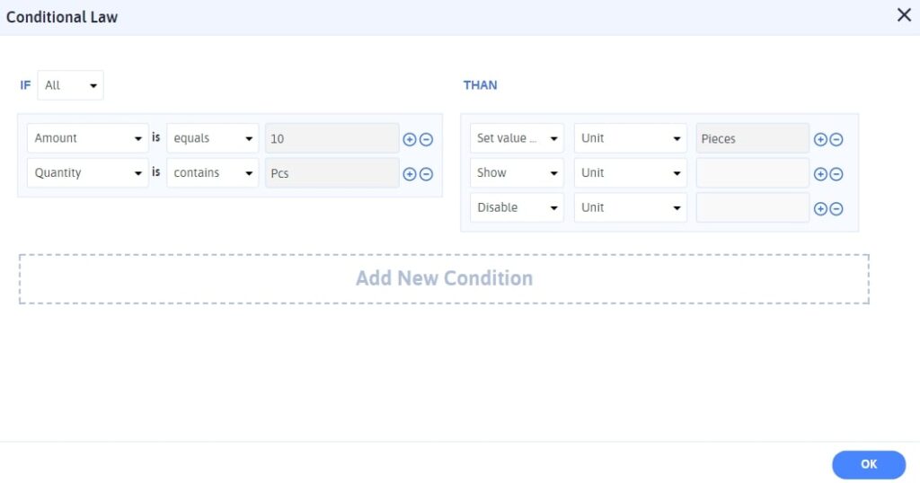
Assume you want to provide a gratis swag present to your event participants. You provide a dropdown menu where the user can select from a water bottle, hat, or t-shirt. Water bottles and headwear may not require more information, allowing the user to proceed directly to the “Register” button. You can, however, choose to include a new “t-shirt size” column for everyone who selects “t-shirt” using conditional logic. One size does not fit everyone, and neither should your WordPress forms.
You may also personalize your form confirmations and auto-replies with ARForms conditional logic. If you’re establishing a donation form, you may need to send users to several confirmation pages based on the quantity of their donation. Alternatively, depending on the facility a customer selects on your reservation form, you might wish to send a second confirmation email. Conditional logic can help with this customization, and much more.
-
Allow your users to pause the Process.
Allowing your users to take a break may seem paradoxical, but it may make a huge difference, especially on lengthier forms. You can easily enable your users to store their progress and continue filling out your form at a later time by selecting the Save and Continue option. This ensures they don’t fully disconnect when confronted with a distraction.
Save and Continue is an excellent feature for longer forms, especially those where your users may need to acquire extra documents or information. When was the last time you applied for a job? You might need to double-check your employment dates or search up the contact details for a reference. Perhaps you need to find that obscure qualification you obtained five years ago on the internet and proudly displayed on your LinkedIn page. You may make a personalized link and even send it to your user so they can return when they’re ready to proceed with the Save and Continue option.
-
Make the request on the Submit Button with a clear CTA.

Keep in mind that a good user experience is centered on users’ objectives. And, believe it or not, no one today intended to “submit a form.” They most likely intended to contact someone at your firm, sign up for your newsletter, register for your event, buy something, or make a reservation. You can tweak the language to speak directly to the user’s purpose by avoiding the usual “submit” label on your final form button.
Consider the following examples:
- Sign Up
- Buy Now
- Get the Guide
- Get Your Free Demo today
- Start Your Free Trial Now
- Try It Now
- Register Now
- Subscribe Today
- Create Account
- Get a Free Quote
- Order Now
A robust and intelligent call to action will remind your users why they’re filling out the form in the first place and motivate them to finish it. Make sure your form tool allows you to adjust this language and the button’s appearance so you can capture your audience’s attention and persuade them to take action.
Conclusion here,
Thus we can take some steps to increase conversion rate using good featured form builder plugin for your WordPress website , If you like this informative write-up share on social media & write concerns in comment section for more needy people, Thank you.
