
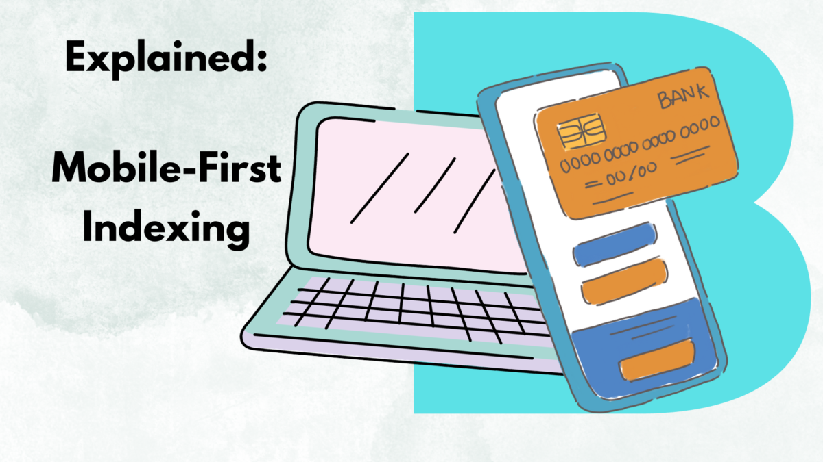
Introduction
One of the most significant shifts in recent years has been the introduction of Mobile-First Indexing by Google. This revolutionary change has transformed the way websites are ranked, emphasizing the importance of mobile-friendliness. In this blog, we’ll delve into what Mobile-First Indexing is, why it matters, and how businesses can adapt to this game-changing SEO paradigm.
Understanding Mobile-First Indexing
Mobile-First Indexing marks a fundamental shift in how Google indexes and ranks websites. Traditionally, Google’s algorithms primarily favored the desktop version of a website for ranking and indexing. However, with the surge in mobile device usage, Google recognized the imperative to prioritize mobile experiences.
Google predominantly utilizes the mobile version of a site’s content for ranking and indexing in a Mobile-First Indexing approach. This means that if your website isn’t optimized for mobile devices, you might experience a significant drop in your search rankings.
Why Mobile-First Indexing Matters ?
- Mobile Dominance: In recent years, mobile internet usage has surpassed desktop usage. Google’s shift towards Mobile-First Indexing mirrors this trend, ensuring that users receive the best possible experience on the devices they most commonly use.
- Improved User Experience: A mobile-friendly website is synonymous with a superior user experience. Fast loading times, responsive design, and easy navigation are pivotal factors that can elevate user satisfaction and engagement.
- SEO Ranking Impact: Non-mobile-friendly websites may experience a decline in their search rankings. This can lead to diminished visibility and, ultimately, fewer organic traffic and potential customers.
Adapting to Mobile-First Indexing
Responsive Web Design:
Adopting a responsive design is paramount. This ensures that your website’s layout and content adjust dynamically to fit various screen sizes, providing an optimal user experience on both desktop and mobile devices.
Mobile Page Speed Optimization:
Mobile users expect websites to load swiftly. Compressing images, leveraging browser caching, and minimizing HTTP requests can enhance loading times.
Prioritize Mobile Content:
Ensure that the mobile version of your site encompasses all the vital content available on the desktop version. This includes text, images, videos, and any interactive elements.
Structured Data Markup:
Guarantee that your website’s structured data (schema markup) remains consistent across both desktop and mobile versions. This aids search engines in comprehending your content more effectively.
Optimize for Local Searches:
Mobile searches frequently entail location specificity. Employ local SEO strategies to ensure your business appears in local search results.
Test Your Mobile-Friendliness:
Utilize tools like Google’s Mobile-Friendly Test to evaluate how well your website performs on mobile devices. Address any issues or errors promptly.
Conclusion
In a world where mobile devices have become an integral part of our lives, adapting to Mobile-First Indexing is no longer an option—it’s a necessity. Prioritizing mobile-friendliness not only aligns with Google’s indexing approach but also provides an enhanced user experience, ultimately benefiting your SEO efforts and business success. Embrace this paradigm shift and stay ahead in the ever-competitive digital landscape. As Bharatlogic said ” Your website’s visibility and user engagement depend on it “.
Frequently Asked Questions (FAQs)
- How can I ensure my website is mobile-friendly?
- What is the impact of Mobile-First Indexing on user experience?
- How can I optimize my website for local searches in the context of Mobile-First Indexing?
- Are there tools available to test my website’s mobile-friendliness?
- How long does it take to see the effects of Mobile-First Indexing on my website’s rankings?