
Call-to-action (CTA) buttons are essential elements on your website and landing pages that guide users towards your desired conversion. These buttons prompt users to take specific actions, such as adding items to their cart, signing up for a free trial, or downloading content. To maximize the effectiveness of your CTAs and increase click-through rates (CTR), it’s important to follow these 17 best practices.
1. Use Action-Oriented Text:
Make your CTA buttons more compelling by using action-packed words that excite and motivate users. Instead of dull words like “submit” or “enter,” opt for dynamic phrases like “get,” “reserve,” or “try.” Tailor the text to reflect the specific offer, such as “Try Our Free Trial,” “Reserve Your Seat,” or “Download Whitepaper.”
2. Choose the Right Colors:
The color of your CTA buttons plays a significant role in capturing user attention. Generally, green and orange buttons are known to perform well. However, the choice of color should also consider your overall website design and ensure proper contrast to make the buttons visually striking. Avoid using a green CTA button on a green background, for example.
3. Consider Button Shapes:
Experiment with different button shapes to find the optimal design for your CTAs. Rounded buttons and buttons with square edges both have their merits and can perform well in different contexts. Test different shapes to determine what works best for your business.
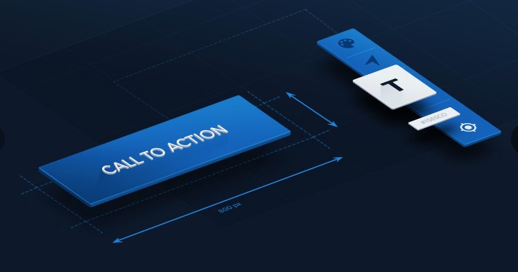
4. Optimal Text Size:
Ensure that your button text is large enough to be easily readable, but not so large that it overwhelms the surrounding content. Strike a balance between drawing attention to the button and maintaining a cohesive visual hierarchy.
5. Keep Text Concise:
While it’s beneficial to use action-oriented text, avoid making your button text excessively long. Ideally, limit the text to two to five words. Long-winded button text can be overwhelming and reduce the clarity of the desired action.
6. Use First-Person Speech:
Consider using first-person language in your button text to increase engagement. Studies have shown that changing button text from the second person (e.g., “get your free template”) to the first person (e.g., “get my free template”) can lead to a significant increase in clicks.
7. Create a Sense of Urgency:
Incorporate a sense of urgency in your CTA buttons to spur immediate action. Use phrases like “Sign Up and Get 50% Off Today Only!” or “Download the Build Apps E-Course for $30 $10!” to create a time-sensitive appeal. Even including words like “now” can subtly convey a sense of urgency.
8. Place Buttons Above the Fold:
To ensure maximum visibility, position your call-to-action buttons above the fold, where users can easily see them without scrolling. This placement helps to capture immediate attention and encourages users to take action promptly.
“We’re a trusted digital marketing company offering great SEO services in Pakistan and website development service in Pakistan, check out our website for affordable options that fit your needs.”
By implementing these best practices, you can create call-to-action buttons that effectively guide users towards your desired conversions. Remember to use compelling language, choose attention-grabbing colors, and optimize button size and placement. Additionally, prioritize clear and concise text, and create a sense of urgency to prompt immediate action. By following these guidelines, you can inspire confidence and trust in your readers and maximize the impact of your CTAs.
FAQs about Effective Call-To-Action Buttons
1. What is a call-to-action (CTA) button?
A call-to-action button is a clickable element on a webpage that prompts users to take a specific action, such as making a purchase, signing up for a newsletter, or downloading a resource.
2. Why are call-to-action buttons important?
CTA buttons serve as crucial conversion drivers by guiding users towards desired actions and increasing engagement on your website.
3. How can I make my CTA buttons more effective?
You can enhance the effectiveness of your CTA buttons by using action-oriented text, choosing attention-grabbing colors, and creating a sense of urgency.
4. What type of text should I use on my CTA buttons?
Use concise and action-oriented text that clearly communicates the desired action to the users. For example, “Buy Now,” “Subscribe,” or “Download Free Guide.”
5. Which colors work best for CTA buttons?
While green and orange are commonly used colors for CTAs, the ideal color choice depends on your brand identity and the overall design of your website.
6. How do I determine the optimal size for my CTA buttons?
Ensure that your button text is large enough to be easily readable, and the button itself is noticeable without overpowering the surrounding content.
7. Should I use first-person or second-person language on my CTA buttons?
Using first-person language, such as “Get My Free Trial,” can create a more personal and engaging experience for users.
8. How can I create a sense of urgency in my CTA buttons?
Incorporate time-sensitive language, limited-time offers, or phrases like “Act Now” to create a sense of urgency and encourage immediate action.
9. Where should I position my CTA buttons on a webpage?
Place your CTA buttons above the fold, ensuring they are visible without the need for scrolling. This location increases visibility and encourages higher click-through rates.
10. Can I use different button shapes for my CTAs?
Yes, you can experiment with various button shapes, such as rounded or square edges, to find what resonates best with your audience.
11. How do I ensure my CTA buttons stand out visually?
Consider using contrasting colors, adding visual effects like shadows or gradients, or using whitespace to make your CTA buttons visually appealing and attention-grabbing.
12. Should I include CTA buttons in my email campaigns?
Yes, including CTA buttons in your email campaigns can help drive recipients to take specific actions, such as visiting your website or making a purchase.
13. How many CTAs should I have on a webpage?
It’s generally recommended to have a clear primary CTA that aligns with your main conversion goal. Additional secondary CTAs can be used sparingly for alternative actions.
14. What is the ideal length for CTA button text?
Keep your button text concise, ideally between two to five words, to maintain clarity and encourage quick comprehension.
15. Can I use CTA buttons on social media platforms?
Yes, you can use CTA buttons on social media platforms to direct users to your website, landing pages, or specific actions, depending on the platform’s features.
16. How can I track the performance of my CTA buttons?
Use analytics tools like Google Analytics or platform-specific tracking features to measure click-through rates, conversion rates, and other relevant metrics.
17. Should I use CTA buttons for mobile optimization?
Absolutely. Mobile optimization is crucial, and using CTA buttons that are mobile-friendly and easily clickable enhances the user experience and encourages conversions.
18. Can I test different versions of my CTA buttons?
Yes, A/B testing different variations of your CTA buttons can help you identify the most effective design, text, color, or placement options for your specific audience.
19. How do I make my CTA buttons accessible for users with disabilities?
Ensure your CTA buttons have descriptive alt text for screen readers, provide sufficient color contrast, and consider additional accessibility features for an inclusive user experience.
20. Are there any best practices for CTA button placement in long-scrolling pages?
In long-scrolling pages, consider placing CTA buttons at strategic intervals to capture user attention as they progress through the content.
21. What is the role of CTA buttons in landing pages?
CTA buttons are essential elements in landing pages as they guide visitors towards completing a specific action, such as filling out a form or making a purchase.
22. How can I optimize my CTA buttons for better conversions?
Test different elements like text, color, size, placement, and design to find the combination that resonates best with your target audience and encourages higher conversion rates.
23. What are some common mistakes to avoid when designing CTA buttons?
Avoid using vague or confusing text, poor color choices, overly complex designs, and placing CTAs in inconspicuous locations that are easily overlooked.
24. Can I use multiple CTAs on a single webpage?
While it’s generally recommended to have a clear primary CTA, you can strategically use multiple CTAs if they serve different purposes or cater to different segments of your audience.
25. How can I make my CTA buttons more persuasive?
Incorporate persuasive language, highlight the benefits or value proposition of taking the desired action, and use social proof or testimonials to build trust and credibility.
26. Should my CTA buttons open in a new window or tab?
It’s generally recommended to keep the user flow consistent and avoid opening CTA links in new windows or tabs, unless there’s a specific need for it, such as when the CTA leads to an external website.
27. What role do micro interactions play in CTA buttons?
Micro interactions, such as subtle animations or visual feedback when a user hovers over or clicks a CTA button, can enhance the user experience and make the buttons more engaging.
28. How can I optimize my CTA buttons for different devices and screen sizes?
Ensure your CTA buttons are responsive and adapt well to different screen sizes, making them easily clickable and accessible on various devices, including smartphones and tablets.
29. Are there any psychological principles I should consider when designing CTA buttons?
Utilize principles like scarcity, social proof, and the fear of missing out (FOMO) to create a sense of urgency and motivate users to take action.
30. What are some real-life examples of effective CTA buttons?
Effective CTA buttons can be found on various websites and landing pages, such as e-commerce sites with clear “Add to Cart” buttons, subscription-based services with enticing “Start Your Free Trial” buttons, and content websites with prominent “Download Now” buttons for valuable resources.
Remember, the effectiveness of your CTA buttons may vary depending on your specific audience and industry, so it’s essential to continually test and optimize them based on user feedback and data analysis.
Author Bio:
I am a passionate blogger. I love to share my thoughts and ideas through blog posting. I have years of experience in Tech, Business, & Health. I am associated with thecryptojournals.net, thecasinojournals.com, thecasinomagazine.com, digiimagination.in, globalbulletinmagazine.com, greenenergyjournals.com, globalcryptomagazine.
